Figma App Design

About this project
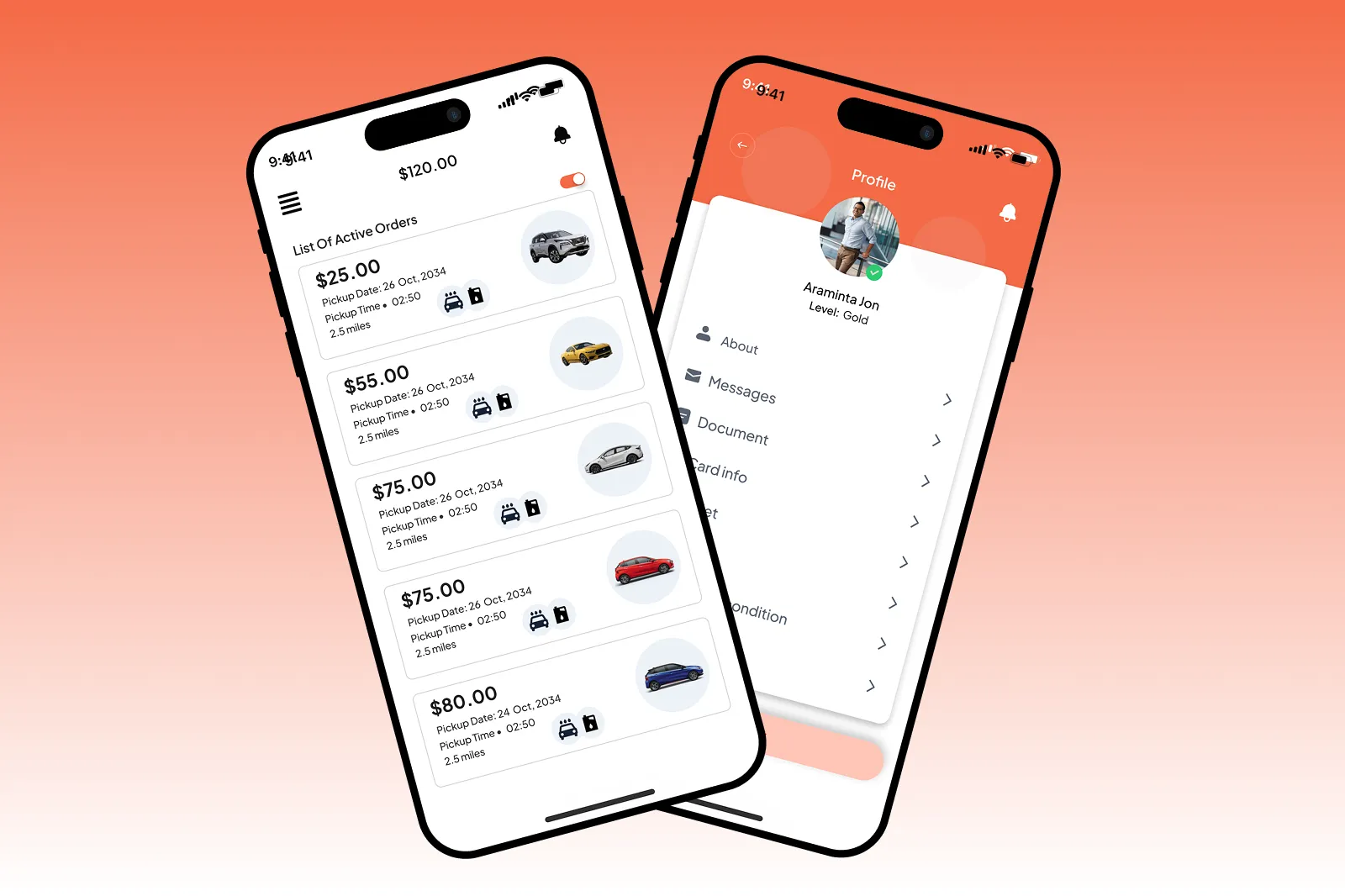
Time is one of the most valuable things a person has, and mundane tasks like refueling a car or finding a car wash should not consume more of it than necessary. This project centered on designing a mobile service app that allowed users to book trusted drivers who could either refuel their vehicles or take them to a nearby car wash station on their behalf. The concept was built around genuine convenience, giving users back their time while ensuring their vehicle was taken care of efficiently and reliably. The client needed a product designer who could take the idea from raw concept all the way through to a polished, interactive experience that real users could navigate with confidence and ease.
How We Did This
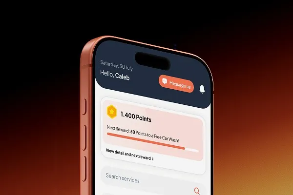
NexCraft led the complete UI/UX design process as the lead Figma designer, covering every stage from initial user research through to final high-fidelity interfaces. The engagement opened with user research to build a clear understanding of how people would realistically interact with the app, what they would expect at each step, and where friction points were most likely to emerge. Wireframes were developed first to map out the full flow of the experience including booking, live tracking, payment, and service status updates, before any visual design work began. Interactive prototypes were built in Figma to allow for realistic testing and feedback at every stage of the process. The final high-fidelity interfaces were designed with a modern visual hierarchy, consistent UI components, and usability-driven decisions throughout. Every feature including fast booking flows, simple navigation, secure payment, and real-time status updates was designed to feel intuitive from the very first interaction, because an app that requires explanation has already lost the user.
What were the results
The project delivered a complete, production-ready UI/UX design that brought the client’s vision to life in a form that was both visually polished and deeply functional. The booking experience was streamlined to minimize the steps between opening the app and confirming a service, reducing drop-off and keeping users moving forward with confidence. Live tracking and service status updates were integrated into the interface in a way that felt reassuring rather than cluttered, giving users real-time visibility without overwhelming them. The secure payment flow was designed to feel smooth and trustworthy, addressing one of the most common points of hesitation in service-based apps. The client received a fully documented Figma design system alongside the final screens, making handoff to development clean and straightforward. The project stood as a complete example of what thoughtful, user-centered mobile design looks like from the very first research question to the very last pixel.